Founding Possiblities
About The Project
Founding Possibilities is a growth studio supporting BIPOC founders in scaling profitable, justice-driven brands that create meaningful impact within their communities.
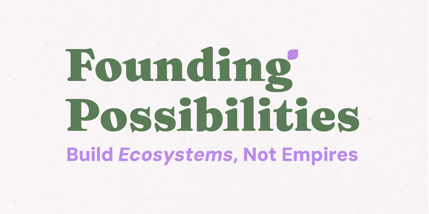
Guided by the philosophy “Build Ecosystems, Not Empires,” the brand needed an identity that could communicate growth, possibility, and collective impact while evolving alongside the studio's future programs and initiatives.
My Role
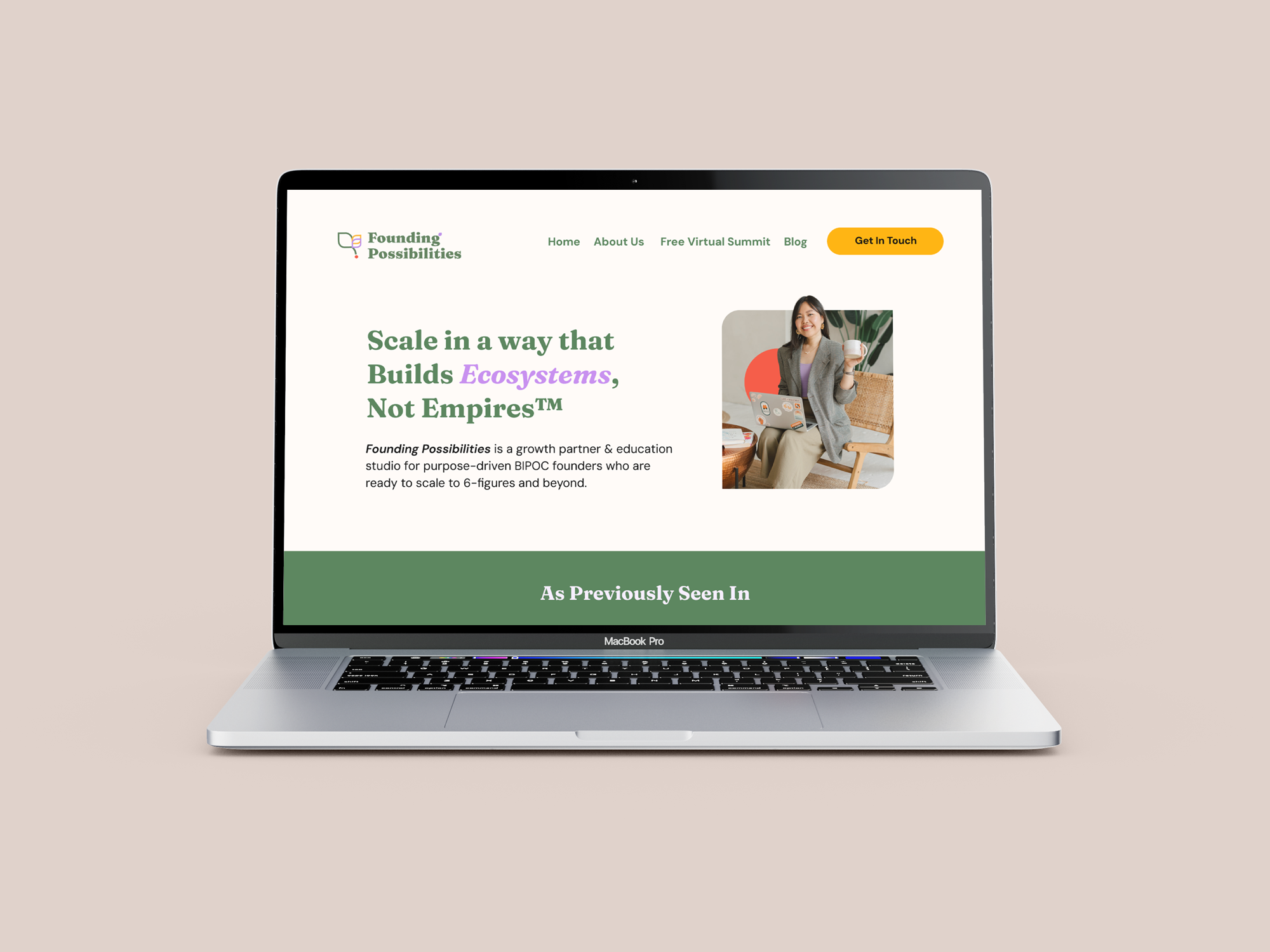
As an independent Design Consultant, my contribution spanned early strategy through design and implementation, helping shape the initial idea into a complete digital experience. This included defining the platform architecture and participation model, shaping the UX and visual identity, and designing and building the final website in WordPress.
Focus
Building a Brand for What's Possible
How do you create an identity around growth that feels collective rather than individual?
Founding Possibilities approaches entrepreneurship through a different lens: one where business growth can strengthen communities and contribute to broader systems of change.
The brand already had a strong sense of purpose and an emerging visual direction. My role was to translate those ideas into a cohesive identity, identifying what was already working, refining the visual language, and building a flexible system that could grow with the studio.
Rather than relying on traditional visual cues associated with business coaching, the direction balances confidence with warmth, creativity, and optimism, reflecting a brand centred on both possibility and collective growth.
At the centre of the experience is an interactive timeline powered by Knight Lab's TimelineJS, customized and integrated into WordPress. I designed the full website experience, including how the timeline connects with the broader platform and how content can be managed as the project grows.
I also conceptualized and designed a custom reaction system, including the icons, while working with the DEDI team to shape the meaning behind each response. Community members can also contribute milestones through a moderated submission process.
The website was designed and built in WordPress with accessibility and long-term management in mind, allowing the team to maintain and evolve the platform independently.
VISUAL IDENTITY
Shaping the Visual Identity
Creating a visual language inspired by growth, connection, and thriving ecosystems.
Founding Possibilities approaches entrepreneurship through a different lens: one where business growth can strengthen communities and contribute to broader systems of change.
The brand already had a strong sense of purpose and an emerging visual direction. My role was to translate those ideas into a cohesive identity, identifying what was already working, refining the visual language, and building a flexible system that could grow with the studio.
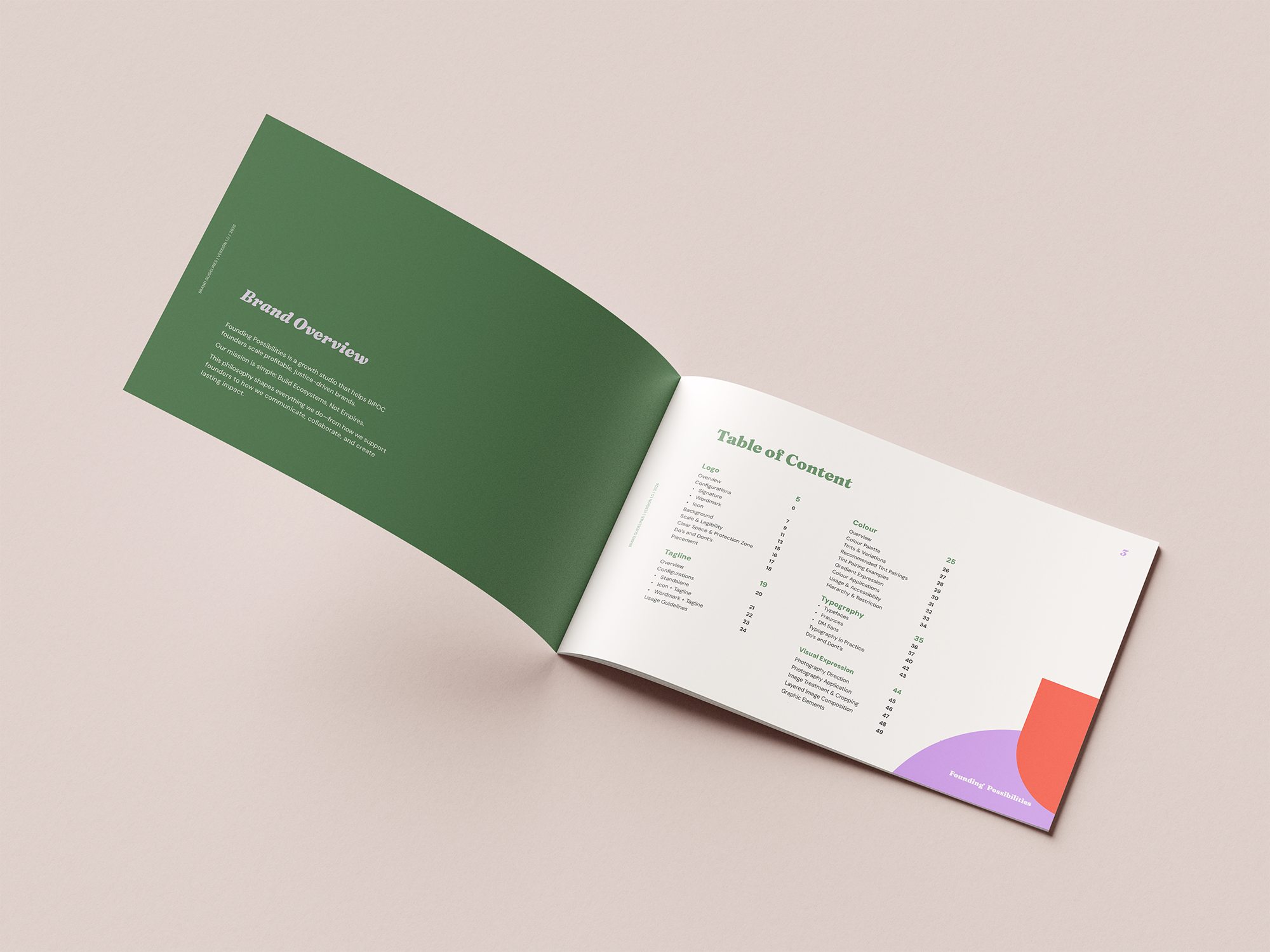
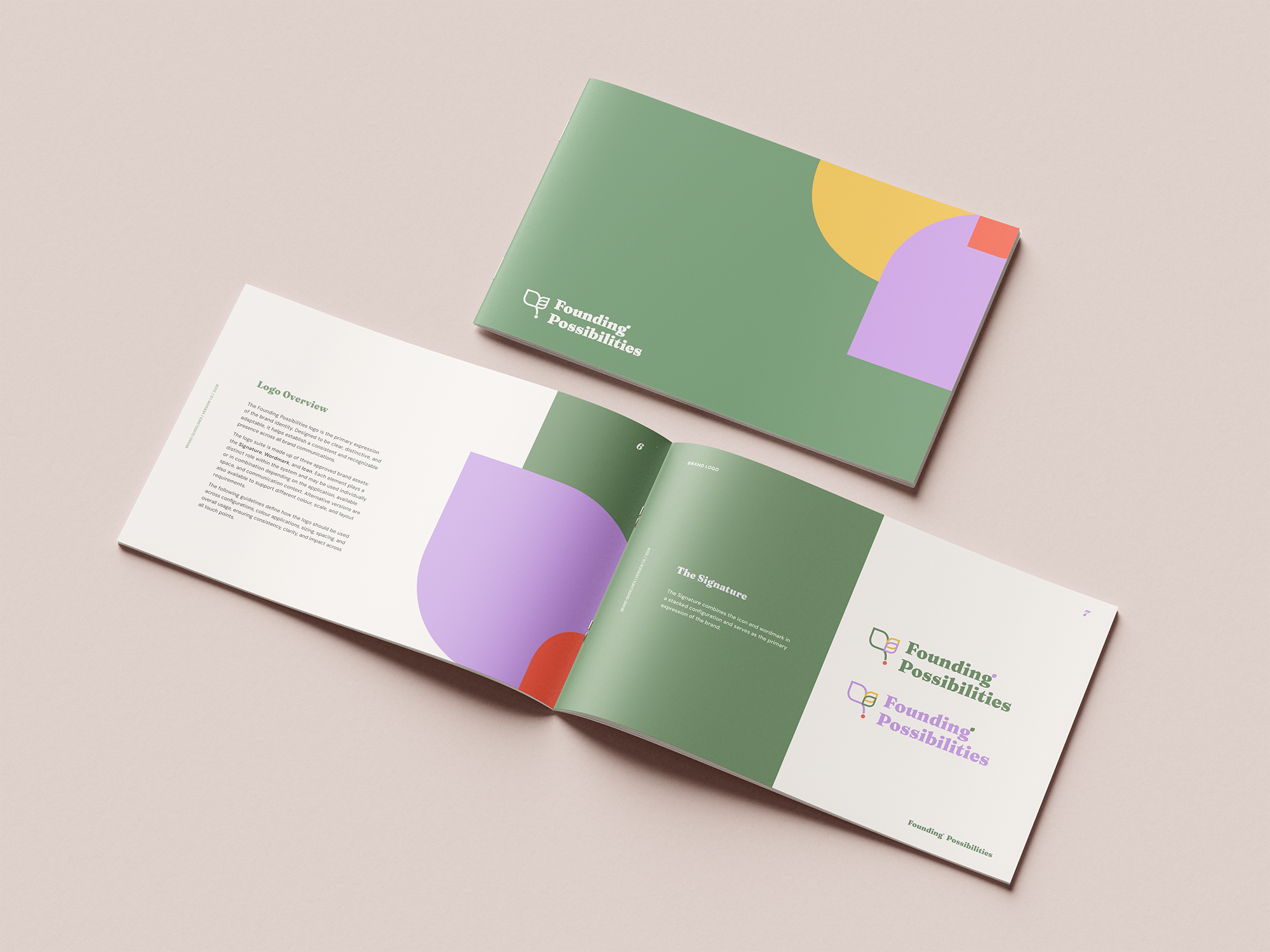
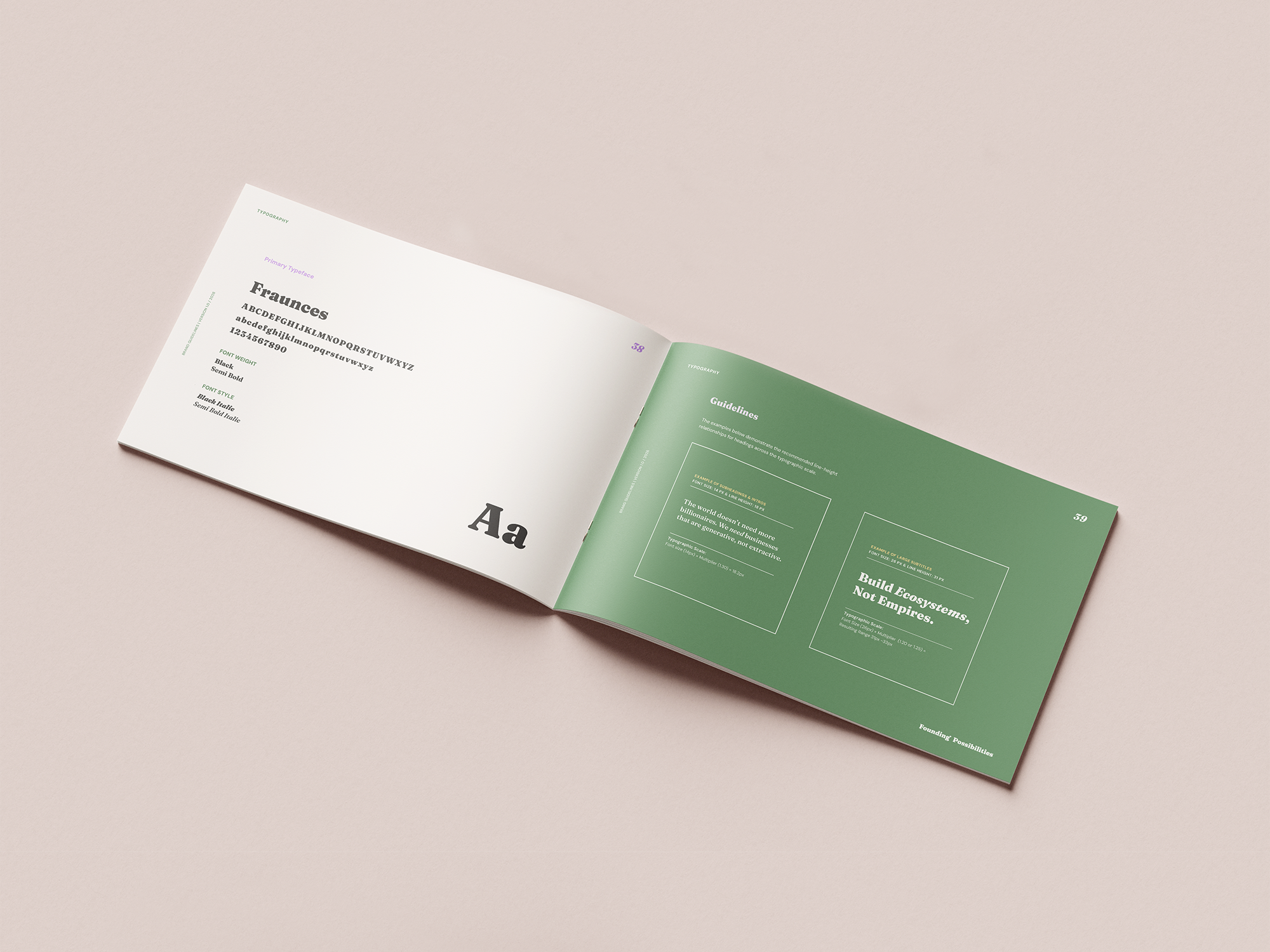
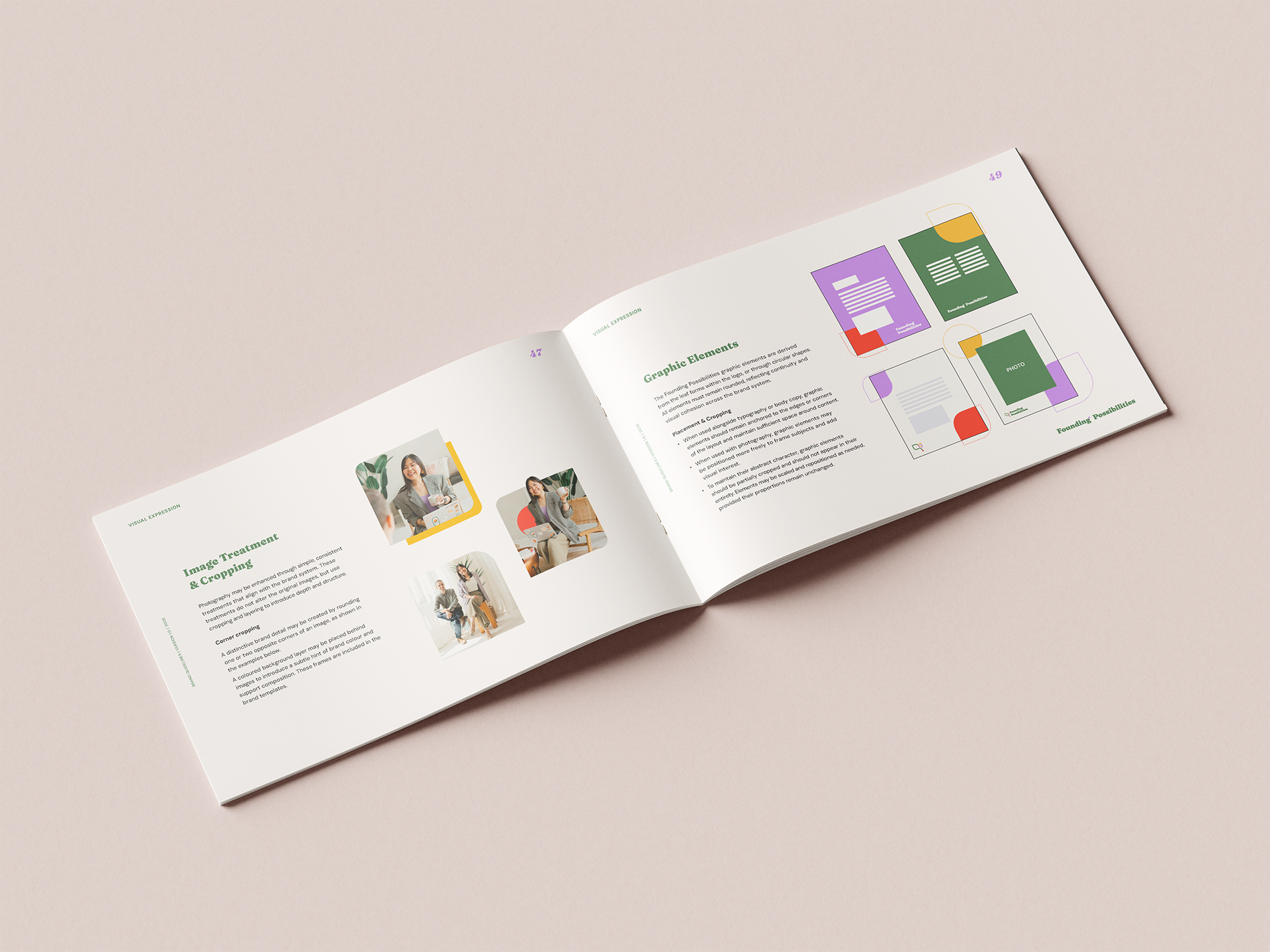
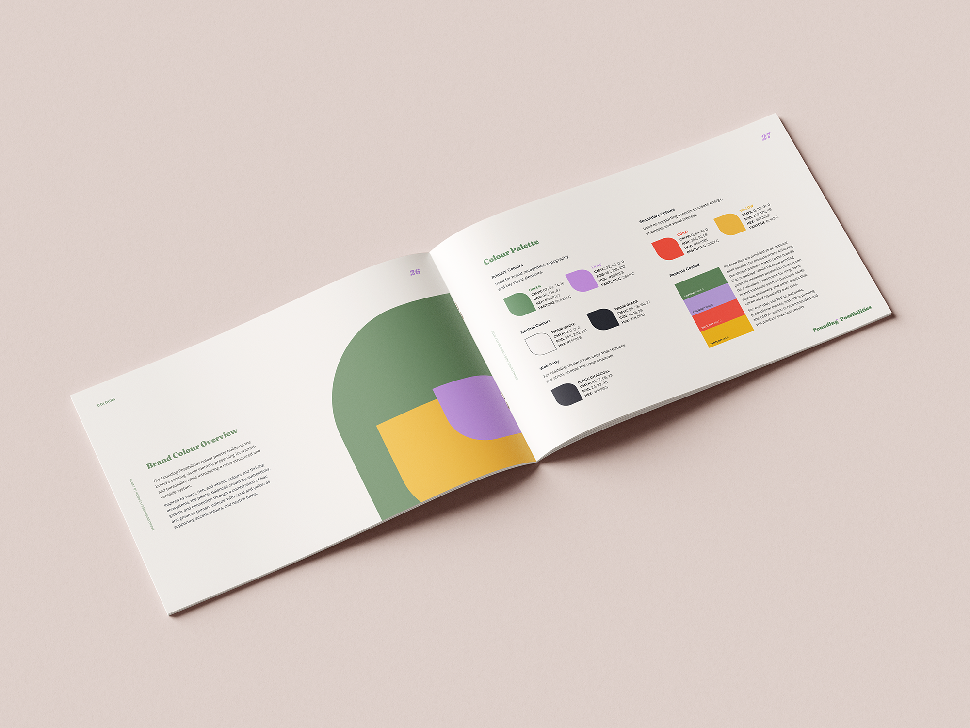
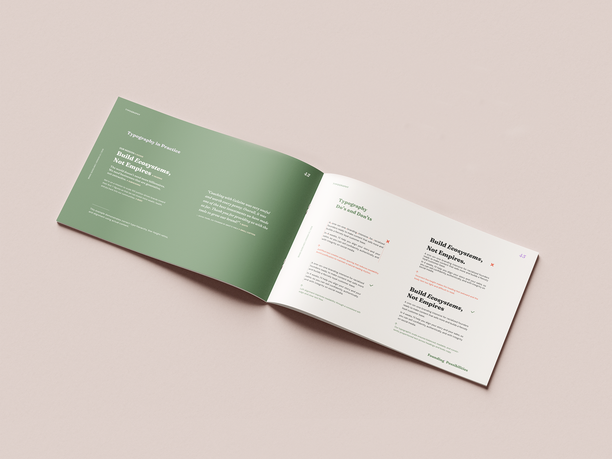
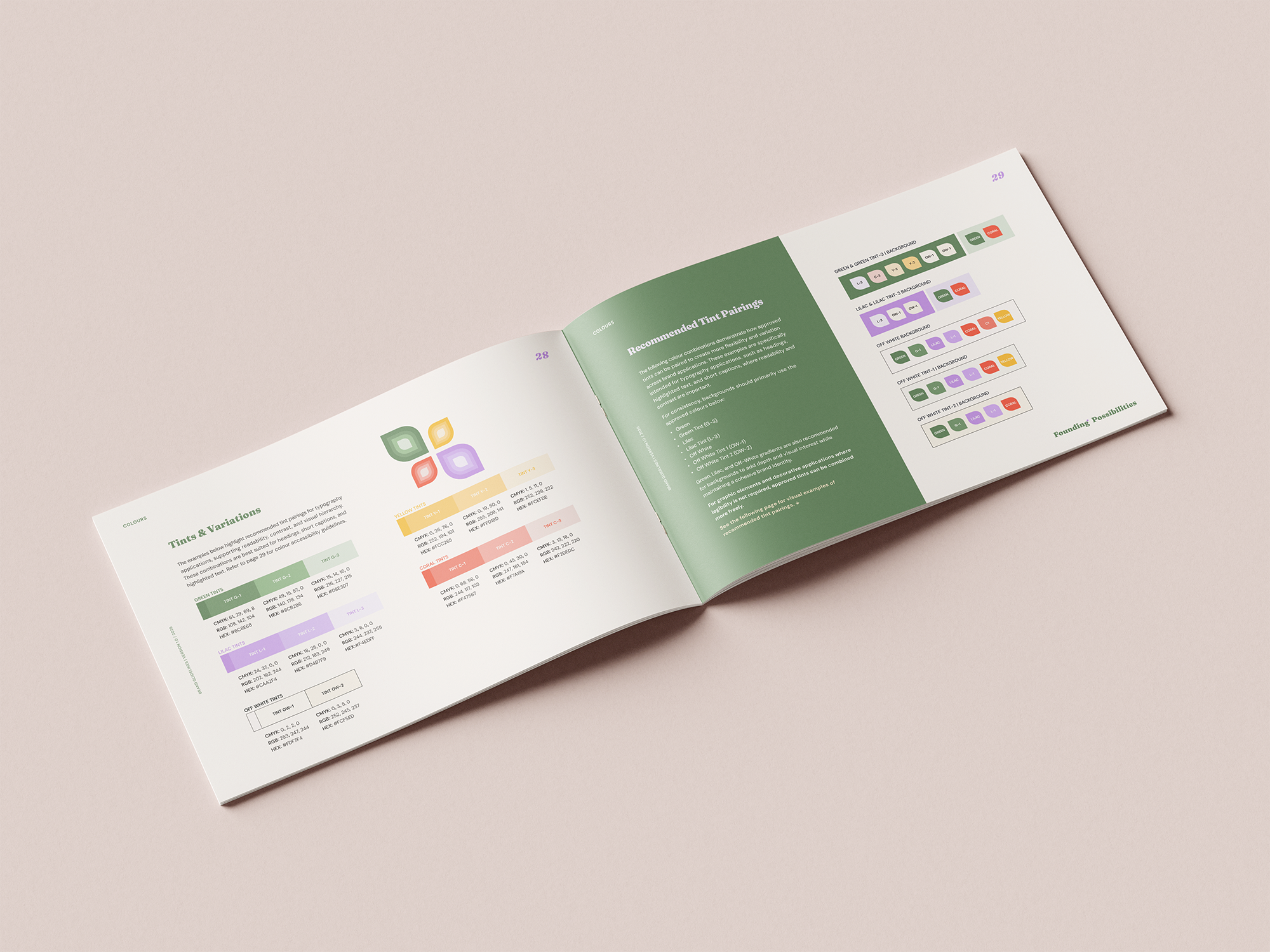
The identity took shape through several rounds of exploration. Early concepts explored iconography connected to the Philippines alongside visual ideas of interconnection, growth, and ecosystems, while intentionally moving away from the minimalist, Eurocentric aesthetic often associated with entrepreneurship and business consulting. The goal was not to reference culture literally, but to explore how the identity could feel more expressive, collective, and rooted in the values behind the brand.
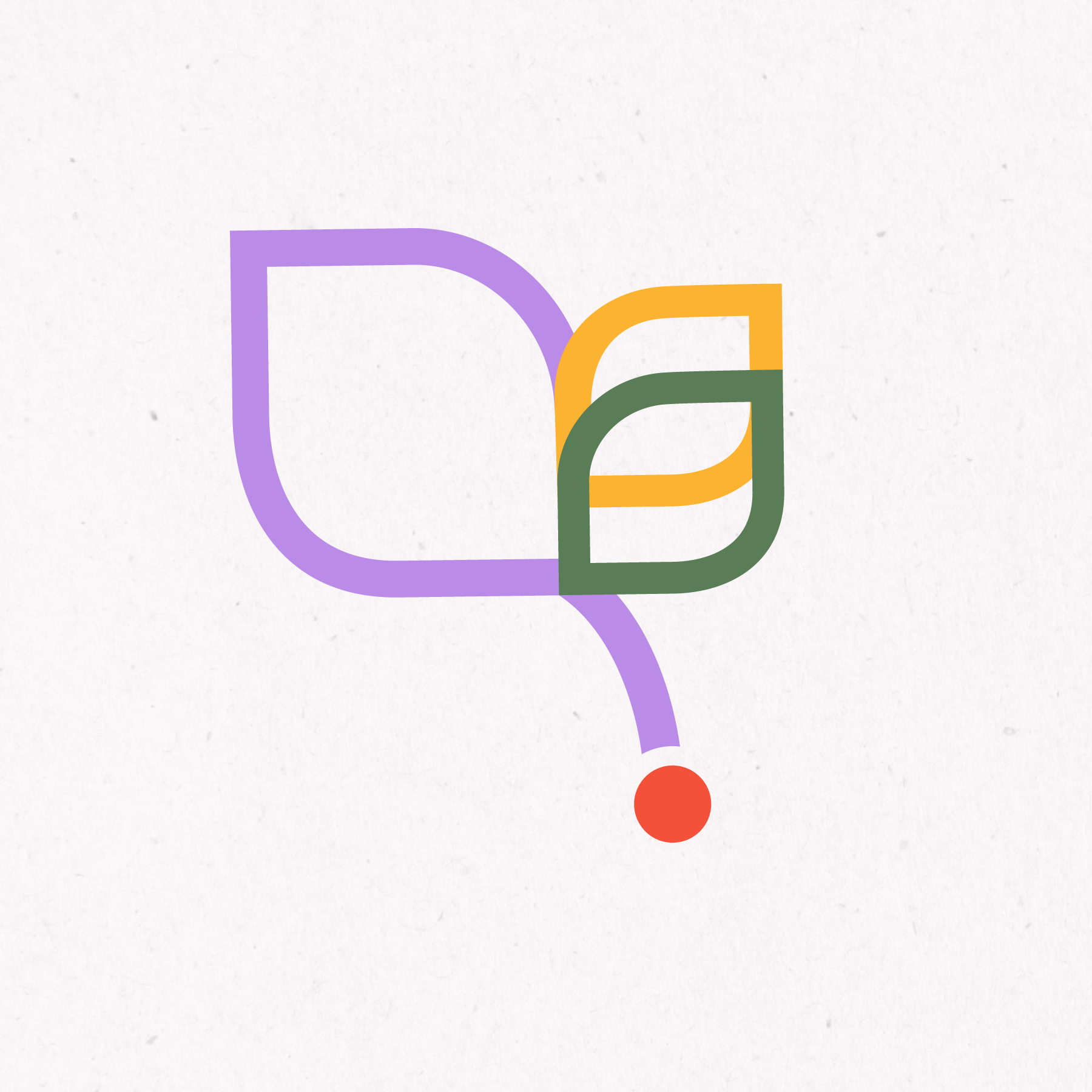
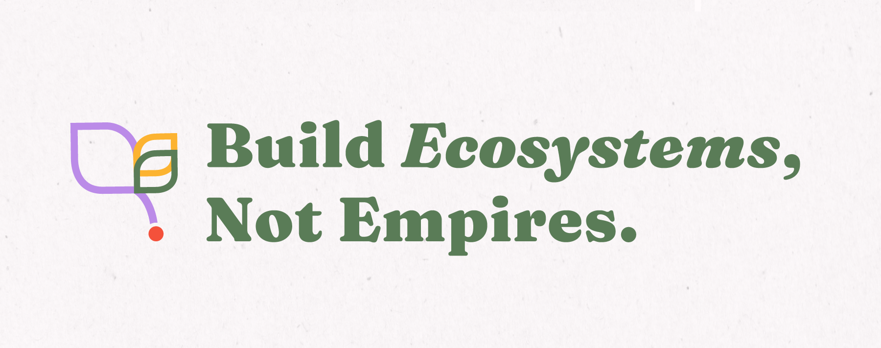
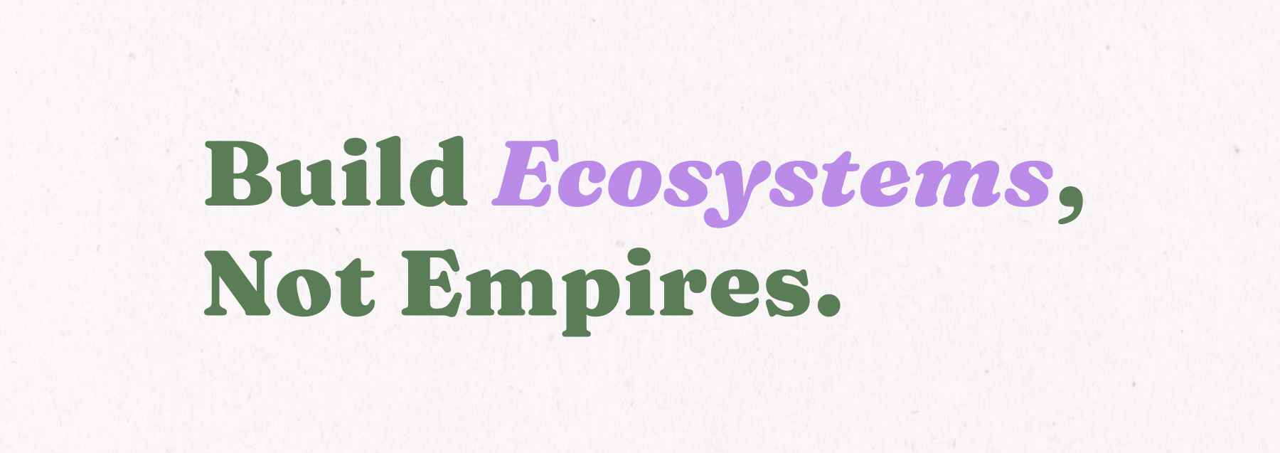
This exploration also shaped the decision to create a flexible logo system rather than a single fixed mark. The wordmark provides a consistent foundation, while the tagline, Build Ecosystems, Not Empires, brings the philosophy of the brand directly into the identity. The icon creates space for a more artistic and personal interpretation of growth and interconnection. Each element can stand on its own or work together, allowing the identity to adapt across different contexts while remaining recognizably Founding Possibilities.
Rather than relying on traditional visual cues associated with business coaching, the final direction balances confidence with warmth, creativity, and optimism, reflecting a brand centred on possibility, interconnection, and collective growth.

Accessibility was also considered throughout the system, particularly in colour combinations, typography, contrast, and digital applications.
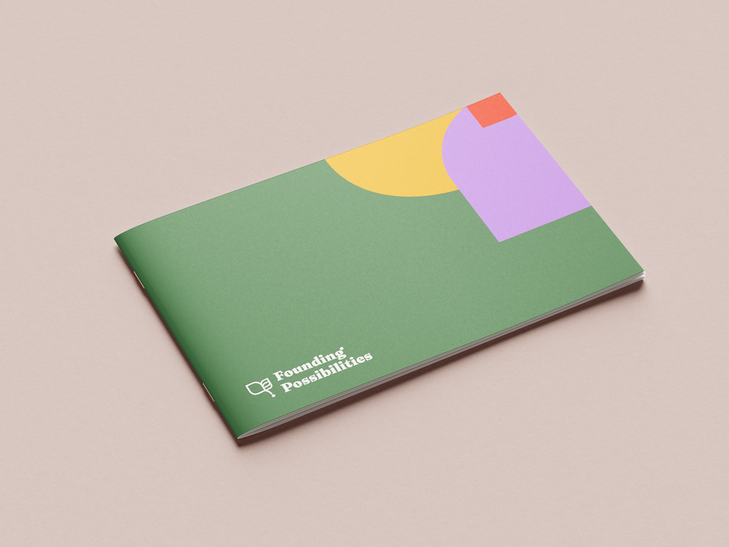
The final 54-page brand guide brings these elements together into a practical framework covering logo usage, colour, typography, imagery, graphic elements, accessibility, and brand application, giving the team and future collaborators the tools to apply and evolve the identity consistently.
Building a Flexible Brand System
Creating consistency without limiting expression.
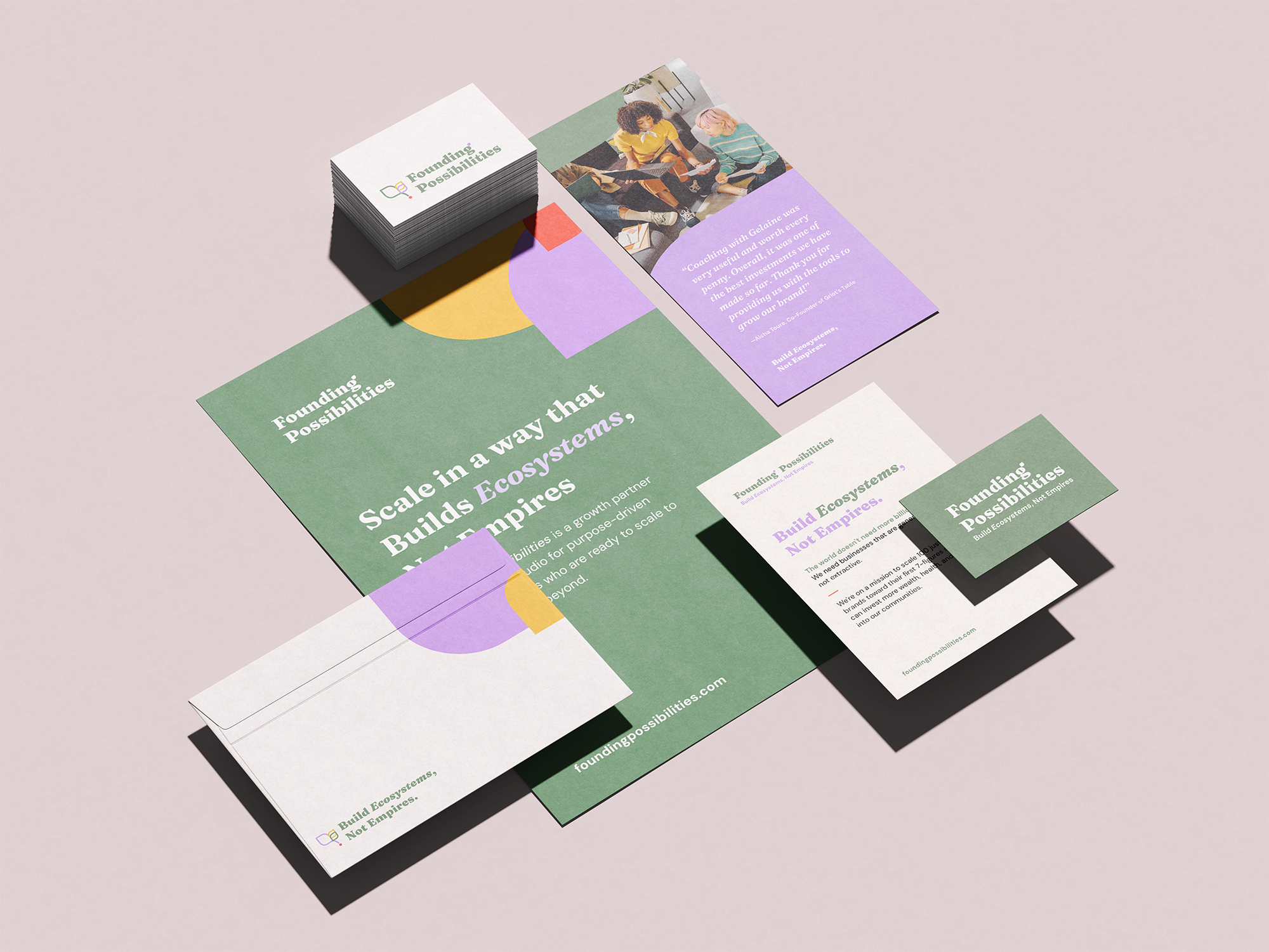
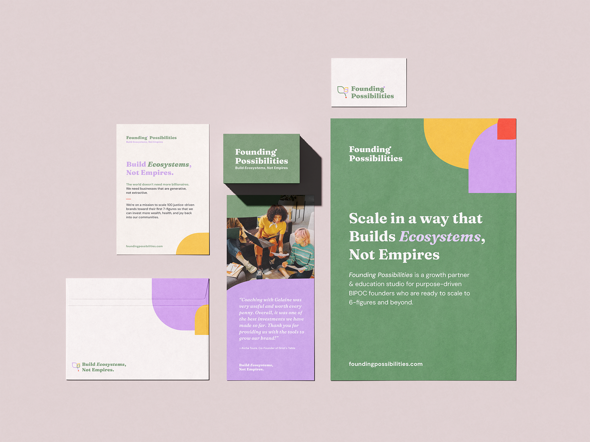
The identity was designed as a flexible system rather than a single logo. A suite of signatures, wordmarks, icons, tagline lockups, colour variations, graphic elements, and image treatments allows the brand to adapt across different formats while remaining recognizable.
Photography and graphic treatments extend the visual language beyond the logo, creating opportunities for layered compositions, expressive cropping, colour, and organic forms across digital and print communications.
REFLECTION
Designing Beyond Launch
Founding Possibilities reinforced the value of approaching brand design as a system rather than a collection of individual assets.
The challenge was creating an identity that could communicate ambition and growth without defaulting to conventional ideas of entrepreneurial success. “Build Ecosystems, Not Empires” became an important lens for thinking about how growth, connection, individuality, and collective impact could coexist within the visual language.
The result is an identity designed not only to represent Founding Possibilities today, but to create space for what the brand can become.